Close icons are not just UI elements; they play a crucial role in guiding user navigation and ensuring a seamless interaction experience. This article delves into the historical progression of these icons, showcasing their adaptation to technological advancements and changing design paradigms. Icons8 has been at the forefront, providing designers with tools and resources to create effective and visually appealing close icons.
Early Designs of Close Icons
- Text to Icons: Initially, close functions were labeled with text such as ‘Exit’ or ‘Close.’ The shift to graphical interfaces brought visual icons to replace text commands.
- Graphical User Interfaces: Innovations by Xerox PARC, and later Apple and Microsoft, introduced icons in place of text, with a focus on clarity and universal recognition.
- Icons8’s Role: Provides access to both classic and modern icon styles, illustrating the shift from text-based commands to graphical icons.
Standardization of the Close Icon
- Emergence of the ‘X’: The ‘X’ symbol became the universal sign for closing applications, appreciated for its simplicity and recognizability.
- Adoption by Operating Systems: Standardized by major systems like Windows and MacOS, the ‘X’ icon helped unify user experience across platforms.
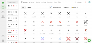
- Icons8’s Contribution: Offers a variety of ‘X’ icons that maintain design standards and ensure compatibility across different environments.
Mobile Revolution
- Design for Touch: Close icons were redesigned to be larger and more accessible for touch interaction on mobile devices.
- Gestural Interfaces: Introduction of gestures, such as swiping, which can sometimes replace the need for a visible close icon.
- Icons8’s Mobile Optimization: Provides icons optimized for mobile applications, ensuring functionality and aesthetic suitability on smaller screens.
Material Design and Minimalism
- Google’s Influence: Material Design promoted a minimalist approach, stripping close icons to their essentials.
- Reduced Visual Clutter: This minimalist trend focuses on reducing distractions, and enhancing user concentration.
- Icons8’s Minimalist Icons: Offers a range of simple and effective icons that align with the principles of Material Design.
Innovations and Variations
- Interactive Elements: Today’s close icons often include animations and interactive enhancements to boost user engagement.
- Brand Identity: Custom icons that reflect a brand’s personality are becoming a staple in app design.
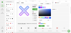
- Icons8’s Customization Tools: Provides tools to create and animate unique icons, allowing for distinct and memorable user interfaces.
Future Trends
- AR and VR Integration: Close icons might evolve into 3D objects or interactive experiences as augmented and virtual realities become more prevalent.
- User Feedback: Continues to guide the evolution of close icons, ensuring they meet changing user expectations and needs.
- Icons8’s Forward-Looking Resources: Poised to supply designers with innovative tools and resources that address emerging technological trends.
Conclusion
The journey from simple text labels to sophisticated, animated symbols underscores the dynamic nature of UI design. Close icons exemplify how thoughtful design considerations can significantly enhance user interaction and satisfaction. Icons8 remains a valuable resource for designers, offering tools and insights that foster creativity and functionality in app design, ensuring that these elements remain as intuitive as they are visually appealing.