Icons have become an integral part of modern graphic design, acting as a universal language that transcends linguistic barriers. These tiny, yet potent visual elements, if used correctly, can enhance your design’s overall aesthetic appeal, improve user experience, and guide your audience’s attention. In this article, we’ll walk you through a practical guide on how to effectively use icons in your graphic design projects, using a popular resource, Icons8, as an example.
The Essential Role of Icons in Graphic Design
To effectively use icons, it’s crucial first to understand their role in graphic design. Icons are essentially symbolic representations of actions, objects, or concepts. They’re designed to convey complex messages simply and efficiently, without the need for extensive text. The versatility of icons is what makes them so valuable in graphic design. Whether you’re working on a website, a mobile app, or a print project, icons can significantly enhance your design.
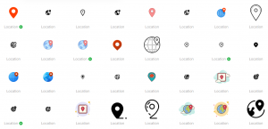
Location icon set by Icons8
Selecting the Right Icons
The first step in effectively using icons is selecting the right ones. The icons you choose should be universally understood and should align seamlessly with the context and message of your design. For instance, using a magnifying glass icon to represent ‘search’ is a universally recognized symbol. It’s essential to consider the recognizability and clarity of the icons you select.
Maintaining Visual Consistency
Consistency is a vital principle in graphic design, and it applies to icon usage as well. Using a consistent set of icons throughout your project helps establish a cohesive visual language, reinforcing your design’s overall aesthetic. Consistent icon usage helps to create a seamless visual experience, contributing to improved user experience and enhanced brand identity.
Consideration of Size and Scale
The size and scale of your icons are another critical aspect to consider. Your icons should be clearly visible without being overly dominant within your design. Depending on the context and platform, you may need to adjust the size of your icons to maintain balance and harmony in your design.
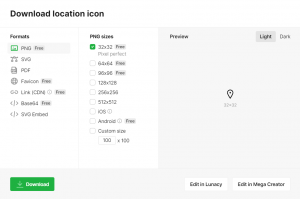
Icon formats on Icons8
Color and Contrast
The color of your icons can significantly impact their visibility and how well they blend with your overall design. When selecting icon colors, ensure they complement your design’s color palette and stand out sufficiently against the background. Additionally, maintaining proper contrast is crucial for ensuring your icons are easily identifiable and legible.
Providing Adequate Space
The space around your icons, often referred to as ‘white space,’ plays a crucial role in ensuring your icons are easily distinguishable and not overcrowded. Providing adequate space around your icons helps maintain a clean, uncluttered design, enhancing readability and visual appeal.
Using Icons to Guide User Attention
One of the most effective uses of icons in graphic design is to guide the user’s attention. Strategically placed icons can create a visual hierarchy in your design, drawing attention to key information or calls to action. By effectively using icons, you can guide your audience through your content in a way that is intuitive and user-friendly.
Conclusion
Icons are powerful tools in graphic design. When used effectively, they can enhance your design’s aesthetic appeal, improve user experience, and guide your audience’s attention. The key to effective icon usage lies in selecting the right icons, maintaining visual consistency, considering size and scale, ensuring proper color and contrast, and providing adequate space around your icons. By mastering these principles, you can leverage the power of icons to elevate your graphic design projects to new heights.