Phone icons are critical in UI/UX design because they enhance navigation and user interaction. Visual shortcuts enable users to quickly understand and access different functionalities without reading lengthy text descriptions. In this article, we will explore the essential phone icons that every designer should incorporate into modern interfaces and best practices for designing these phone icons effectively. You can improve your mobile applications’ usability and aesthetic appeal by integrating well-designed phone icons.
Characteristics of Effective Phone Icons
To ensure that phone icons contribute positively to the user experience, they must possess certain key characteristics:
- Clarity and Simplicity: Phone icons should be easily recognizable and clearly convey their function. Avoid unnecessary details that might complicate the visual message.
- Consistency with Overall Design: Phone icons must match the app’s visual style and tone. This includes using a consistent color palette, line thickness, and overall design language.
- Scalability and Responsiveness: Phone icons must look good and remain functional at different sizes and resolutions. This ensures that they are effective on various devices and screen sizes, from small smartphones to larger tablets.
- Appropriate Color Usage: Colors should enhance visibility and align with the app’s color scheme. Proper color contrast ensures that phone icons are distinguishable in different lighting conditions and for users with color vision deficiencies.
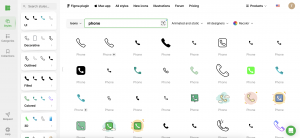
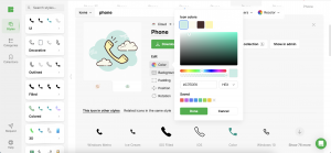
Using a resource like Icons8 can help you find phone icons that meet these characteristics. They offer a wide range of professionally designed icons tailored for various applications.
Core Phone Icons Every Designer Should Know
Here are the core phone icons that are crucial for any mobile interface:
- Call: Represents the phone’s primary function. Typically depicted with a handset symbol, this phone icon is essential for making and receiving calls.
- Message: Symbolizes text messaging. Commonly shown as an envelope or speech bubble, this phone icon directs users to their SMS or chat applications.
- Contacts: Indicates the user’s address book. Often shown as a person’s silhouette, this phone icon allows users to easily access and manage their contacts.
- Voicemail: This phone icon is used to access voice messages. Usually depicted with a tape or voicemail icon, it provides a visual cue for users to check their voicemail.
- Settings: This phone icon represents configuration options. Typically illustrated with a gear or cogwheel, it leads users to their device or app settings for customization.
Icons8 offers a comprehensive collection of these core phone icons, ensuring you have high-quality, ready-made designs that are functional and visually appealing.
Best Practices for Designing Phone Icons
To create effective phone icons, follow these best practices:
- Use Universally Recognized Symbols: Ensure that phone icons are easily understood without the need for additional labels. This reduces cognitive load and improves user efficiency.
- Maintain a Uniform Style: To create a cohesive interface, keep a consistent visual style across all phone icons. This includes maintaining uniformity in stroke width, color schemes, and design motifs.
- Test Icons for User Comprehension: Validate that users can correctly interpret the phone icons’ meanings through usability testing. Gather feedback to identify any ambiguities or misunderstandings.
- Iterate Based on User Feedback: Continuously improve phone icons based on user interactions and feedback. Iterative design processes help refine icons to better meet user needs and preferences.
Using tools like Icons8, you can access a vast library of phone icons that adhere to these best practices, simplifying the design process and ensuring consistency.
Tools and Resources for Designing Phone Icons
Utilize these tools and resources to aid in designing phone icons:
- Design Software: Adobe XD and Sketch offer robust tools for phone icon design, allowing you to create and customize icons with precision.
- Icon Libraries: Icons8 and Font Awesome provide extensive collections of ready-to-use phone icons, saving time and ensuring quality.
- Prototyping Tools: Use tools like InVision and Figma to create and test phone icon prototypes. These platforms enable you to simulate real-world usage and gather valuable user feedback.
Icons8, in particular, offers a user-friendly platform with a wide range of customizable phone icons, making it easier for designers to find and adapt icons to fit their specific needs.
Case Studies: Successful Phone Icon Designs
Examining successful phone interfaces can provide valuable insights:
- Apple iOS: Apple’s phone icons are minimalist and highly intuitive, setting a high standard for clarity. Their consistent use of simple, universally recognized symbols enhances user experience.
- Google Android: Android phone icons are versatile and adaptive, showcasing excellent scalability and consistency. The Material Design guidelines emphasize clarity, simplicity, and color contrast.
- WhatsApp: WhatsApp’s phone icons are straightforward and universally understood, enhancing user experience. Their design focuses on clarity and accessibility, ensuring that users can quickly identify and use key functions.
Key takeaways from these examples include the importance of simplicity, consistency, and user-centered design. Icons8 offers case studies and examples of effective phone icon use, providing inspiration and guidance for your designs.
Common Mistakes to Avoid
Avoid these pitfalls when designing phone icons:
- Overcomplicating Designs: Complex phone icons can confuse users and detract from usability. Keep designs simple and focused on conveying a single, clear message.
- Ignoring Accessibility Standards: Ensure phone icons are accessible to all users, including those with visual impairments. Use appropriate color contrast and provide alternative text descriptions where necessary.
- Neglecting to Test Icons in Real-World Scenarios: Phone icons should be tested in various contexts to ensure they perform well in actual use. This includes different screen sizes, resolutions, and lighting conditions.
Icons8 offers tools and resources to help you avoid these common mistakes, providing guidelines and best practices for accessible and user-friendly phone icon design.
Conclusion
Well-designed phone icons are essential for creating intuitive and efficient mobile interfaces. By following best practices and learning from successful examples, designers can craft phone icons that enhance the overall user experience. Icons8 provides a vast library of high-quality phone icons and design resources to help you achieve this goal. Apply these principles in your projects to improve navigation and user satisfaction.
Also, check our posts with free wireframe tools, wireframe software for Mac and UI/UX design tools in mobile app development.